Getting Started with Friendbuy
Getting Started with Referral
Plan Your Referral Program Implementation Team
Merchant SDK Setup with Google Tag Manager
How to Join Your Team on Friendbuy
Best Practices
Referral Program Placements
Friendbuy Referral Emails
Driving Referral Program Awareness
Referral Offer Strategies
Limited-Time Offer Promotions in Referral
Referral Contests, Sweepstakes and Giveaways
A/B Testing Best Practices
Account Management
How can I invite my team to the Friendbuy platform?
Managing Your Account Settings
How to Set Up and Change Your Email Sender
Referral Campaign Management
Widgets
How to Create a New Theme
How to Make Changes to a Theme
Widget & Email Image Specifications
How to Apply Theme Changes to a Widget
How to update a Widget or Theme to the latest version
How to Set Up a Ribbon
How to Set Up an Advocate Landing Page
How to Set Up a Friend Landing Page
How to Set Up a Post-Purchase Overlay
How to Set Up an Account Page Widget
How to configure your Terms & Conditions
How to Test a Widget
How to Set up a Self-Referral Overlay
How to Set Up a Customer Dashboard
How to Personalize Your Widgets with the Advocate name
Character Count Recommendations
Campaign Settings
How to Create a New Referral Campaign
How to set up Referral Code Personalization for PURLs
Setting Up an Advocate Reward
Setting Up a Friend Incentive
Shopify Coupon Codes Integration
How to Run an A/B Test
How to Change Your Referral Offer
Setting Up Max Clicks for Referral Links
How to Generate Personalized URLs (PURLs) through Our API
How to Generate Personalized URLs (PURLs) for Advocates
How to Configure Tiered Rewards
How to Archive a Referral Campaign
Understanding A/B Test Analytics
How to Duplicate Your Campaign
How to Set Up a Redirect for Limited Time Campaigns
How to Create a Product Sharing Referral Campaign
How to set up Code Based Sharing
Code Banks
How to Create a New Code Bank
How to Generate Coupons in Bulk for Shopify
Setting Up Low Code Bank Notifications
How to Add Codes to an Existing Code Bank
Emails
Email Types for Your Referral Program
How to Add DNS Records for Email Sender Verification
How to Create, Edit, and Manage Emails
How to set up an Expiration Reminder email
How to Assign an Email to a Campaign
Referral Reward Store
Regional Restrictions: Block Your Referral Program in Specific Countries
Generate a QR Code for a Referral Link (API)
Store Credit Rewards for Referral (Shopify Integration)
Loyalty Program Management
Uploading Data From a Legacy Loyalty Program
How to Set Up Purchase Based Member Tiers Program
How to Set Up a Points-Based Member Tier Program
How to Set Up Points Redemption Options
How to Set Up Shopify Coupon Code Integration in a Loyalty Earning Event
How to Set Up a Loyalty Opt-in CTA
Understanding the Loyalty Analytics
Manually Reward Customers via CSV Upload
Rolling Points Expiration Reminder Emails
Manually Opt a Customer In or Out of Loyalty
Receipt Scanning for Loyalty
How to Display Loyalty Points on a Product Detail Page (PDP)
How to Create an Earning Event
Cashback Rewards for Loyalty (Shopify Integration)
How to Configure an Earning Event in your Loyalty Program
How to set up expiration for Points or Account Credit
How to Set Up the Loyalty Progress Bar Widget
How to Create, Edit, and Manage Loyalty Emails
Integrations
Attentive Integration
Send a Triggered Text to Prompt a Referral After a Positive Review with Attentive and Okendo
Automatically Prompt a Referral Post Purchase in Attentive
Send Referral Program Text Messages Through Attentive
How to Text Coupon Codes to Advocates using Attentive Journeys
Make it Easy for Advocates to Refer by Sending Their PURL Through SMS using Attentive Journeys
How to Send Advocates a Reminder Text to Redeem Their Coupon Codes through Attentive Journeys
How to Send Referred Friends a Reminder Text to Redeem Their Coupon Codes through Attentive Journeys
How to reward Loyalty Members for signing up for Attentive text messages and emails
How to Include a Customer's Loyalty Points Balance in an Attentive Text
How to Send a Coupon Code to a Referred Friend using Attentive Journeys
How To Enable the Attentive Integration
Braze Integration
How To Enable The Braze integration
How to Send One Time Emails with Referral Links through Braze
How to Send Referral Links Post Purchase Through Braze
How to Email Coupon Codes Through Braze to Advocates and Friends After They Are Distributed by Friendbuy
How to Promote Your Referral Program via SMS (Through Braze)
How to Trigger a Text to Remind Advocates to Redeem Referral Rewards (Through Braze)
How to Trigger a Text to Remind Referred Friends to Redeem Their Incentives (Through Braze)
How to Send Coupon Codes Through Braze SMS to Advocates and Friends After They Are Distributed by Friendbuy
How to Prompt a Referral After a Positive Review with Friendbuy and Trustpilot (via Braze)
Cordial Integration
DataGrail Integration
Ethyca Integration
Fivetran Integration
Iterable Integration
Trigger a Direct Mail Campaign to Drive Referral Program Awareness (Friendbuy x Iterable x Poplar)
How to Enable the Iterable Integration
How to Automatically Text Referred Friends their Coupon Code with Iterable Journeys
How to Prompt a Referral After a Positive Review with Friendbuy and Trustpilot (via Iterable)
Increase Referral Program Awareness with a Dedicated Email Blast through Iterable Journeys
Klaviyo Integration
How to send Referral Links Post Product Review (Yotpo + Klaviyo)
How to Prompt a Referral After a Positive Review with Friendbuy and Trustpilot (via Klaviyo)
How to send one time emails with referral links through Klaviyo
How to Send Referral Links Post Positive Product Review (Okendo + Klaviyo)
How to Send Referral Links Post Purchase through Klaviyo
How to Promote Your Referral Program via SMS (Through Klaviyo)
How to Enable the Klaviyo Integration
How to Distribute a Reward To Your Loyalty Members on Their Birthday (Through Klaviyo)
How to Send a Customer their Loyalty Points Balance Through Klaviyo
How to Email Coupon Codes Through Klaviyo to Advocates and Friends After They Are Distributed by Friendbuy
How to Reward Customers for Providing a Review Through Yotpo via Klaviyo Through Your Loyalty Program
How to Send Reminder Texts to Redeem Loyalty Rewards Through Klaviyo
Upgrading to Klaviyo OAuth with your Friendbuy Integration
How to Reward Customers for Providing a Review Through Okendo via Klaviyo Through Your Loyalty Program
How to Trigger a Text to Remind Advocates to Redeem Referral Rewards (Through Klaviyo)
How to Trigger a Text to Remind Referred Friends to Redeem their Incentives (Through Klaviyo)
How to Send Coupon Codes through Klaviyo SMS to Advocates and Friends After They are Distributed by Friendbuy
How to Reward Customers For Subscribing to Klaviyo Emails and Texts Through Your Loyalty Program
How to Segment Customers Based on Tier Status in Klaviyo
How to Reward Customers for Providing a Review Through Stamped via Klaviyo Through Your Loyalty Program
Kustomer integration
Ordergroove Integration
Recharge Integration
Friendbuy Recharge Integration: Renewal Milestone Rewards
How to Enable Friendbuy's integration with Recharge
Salesforce Commerce Cloud
Segment Integration
How to Integrate Friendbuy as a Segment Source
How to set up the Segment Web-Mode (Destination Actions) Integration
Shopify Integration
How to Enable the Shopify Integration
Shopify Checkout Extensibility
Checkout Extensibility - Shopify Pixel Tracking
Shopify Theme App Embed
How to Add the Friendbuy Referral Widget and Referral Dashboard to Shopify Customer Accounts
How Friendbuy Powers Loyalty Point Refunds with Shopify
How to Integrate Friendbuy with Shopify POS for Loyalty and Referral
Tango Card Integration
Tremendous Integration
Postscript Integration
How to Integrate Your Friendbuy Loyalty and Referral Program with Rise.ai to Issue Stackable Gift Cards and Account Credit
Friendbuy + Stripe Integration (Referral Program)
How to Integrate with Ordergroove
Configuring the Friendbuy MCP in Claude and ChatGPT
Fraud Prevention
How to Block a Referral Code
How to Block an Email Address
Fraud Settings and Business Rules
Configuring a Global Reward Allowance
Configuring a Referral Link Fallback URL
How the Similar Email Address Fraud Check Works
Customer Service Portal
How do I check the status of a referral?
Customer Profile Name Updates from Widget Submissions
How to Manually Add or Remove Credit / Points to a Customer's Account
Why was my customers reward rejected?
The Referred Friend put in their email address but didn’t get their coupon code. How do I find this?
Resend Reward Email
Override a Rejected or Pending reward
How to Search for a Customer Profile
How to Search for a Customer’s Referral Link in the Friendbuy Platform
How to create a Manual Referral
Why didn't the Advocate receive a Reward for a successful referral?
Reasons for Rejected Advocate Rewards and Friend Incentives
Analytics & Reports
Performance Overview
Reports
Mark purchases as "Test" to maintain clean reporting
Top Advocates Report
Scheduled Reports
Account Credit or Points Statement Export
Exporting Reports from Friendbuy
Email & SMS Report
Advocate Rewards Report
Purchases Report
Friend Incentives Report
Understanding the Codes Report
Dashboards
Referral Performance Analytics Dashboard
Advocate Referral Widget Source Tracking
Referral Analytics Dashboard Overview Metrics
Advocate Reward Email Analytics
Loyalty Email Analytics
Common FAQs
What does Fraud Protection do?
How to Access my Billing Information
What is a typical referral flow?
How to Apply Theme Changes to a Widget
Difficulty downloading reports after you receive an export email?
What are Fraud Checks, Tier Checks, and Rules Checks in the Rewards Report?
How do I change my password?
What is a self-referral redirect URL?
What do the Reward Statuses and Definitions mean?
How to Create a New Theme
What is a Friend Widget?
How are Conversions Tracked in Friendbuy?
A Glossary of Terms
How long is the Referred Friend attribution window
Common Scenarios and Troubleshooting Steps
Developer Documents
Influencer Program Management
- All Categories
- Loyalty Program Management
- How to Set Up the Loyalty Progress Bar Widget
How to Set Up the Loyalty Progress Bar Widget

The Loyalty Progress Bar widget shows logged-in Loyalty members how close they are to their next Member Tier, right on your site. It displays the member's current tier badge, their points, and a visual bar toward the next tier.
Benefits
- Motivate the next purchase: A visible "almost there" goal encourages members to keep earning.
- Reinforce tier status: Each tier can have its own badge colors, so members instantly recognize their status.
- No development work: Create, style, and place the widget from Loyalty > Widgets.
- Mobile-ready: The widget adjusts automatically at phone widths.
Before You Begin
Make sure you have the following in place:
- An active Member Tier program with at least two tiers. If you haven't set one up yet, see How to Set Up a Points-Based Member Tier Program or How to Set Up Purchase Based Member Tiers Program.
- The page where the widget will appear. You'll need its URL (for example,
loyalty-dashboard) and the HTML element to place the widget in (for example,#dashboardDiv). - A logged-in test account that holds a tier, so you can preview the widget on your site after publishing.
How to Set Up the Loyalty Progress Bar
Step 1: Create the widget
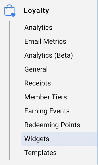
- Navigate to Loyalty > Widgets.
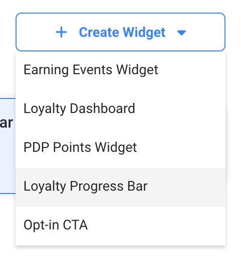
- Click + Create Widget and select Loyalty Progress Bar.
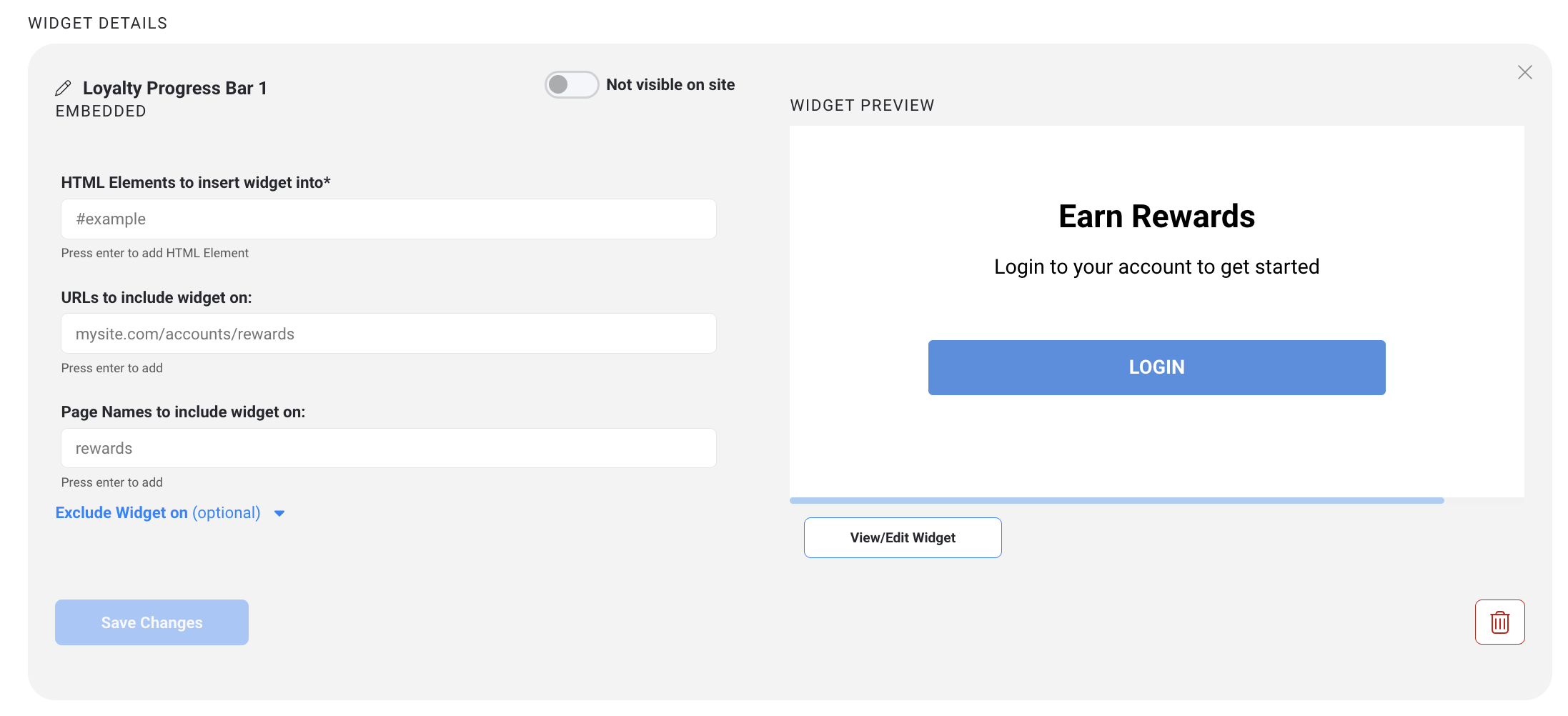
- A new widget named Loyalty Progress Bar is created and its Widget Details pane opens that can be edited.
Step 2: Place the widget on your site
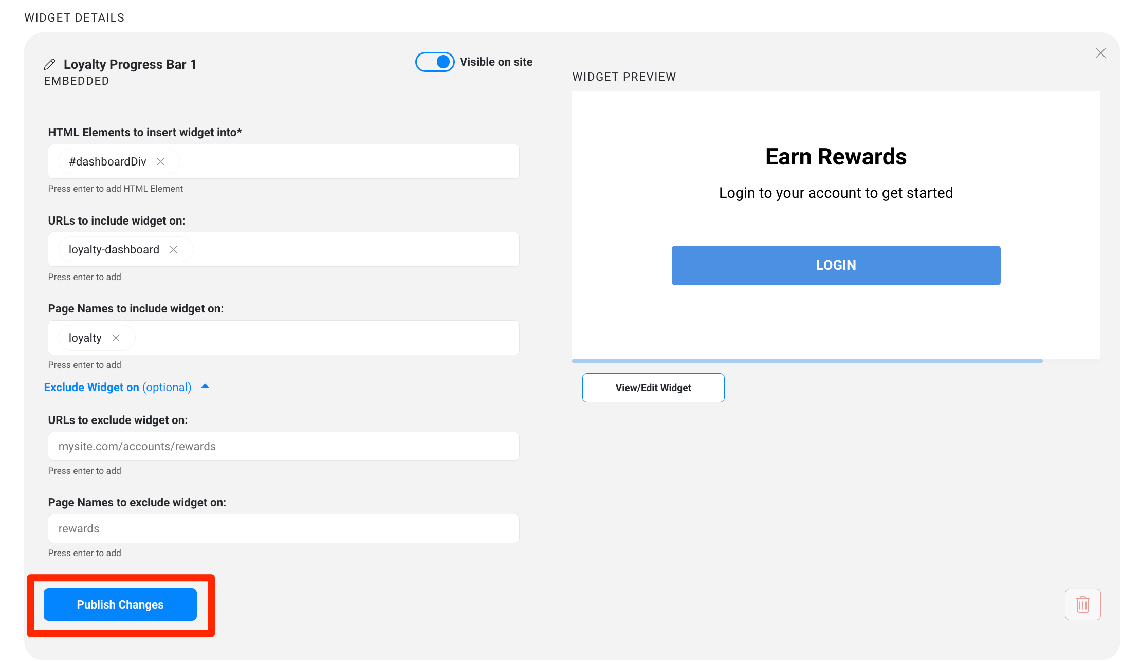
- In Widget Details, enter the HTML element where the widget should render (for example,
#dashboardDiv).
- Enter the URL of the page where it should appear (for example,
loyalty-dashboard) or the page name to include the widget on (example,loyalty).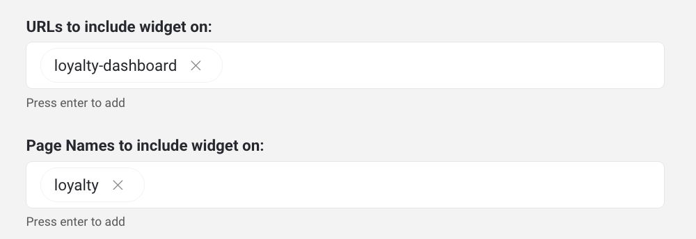
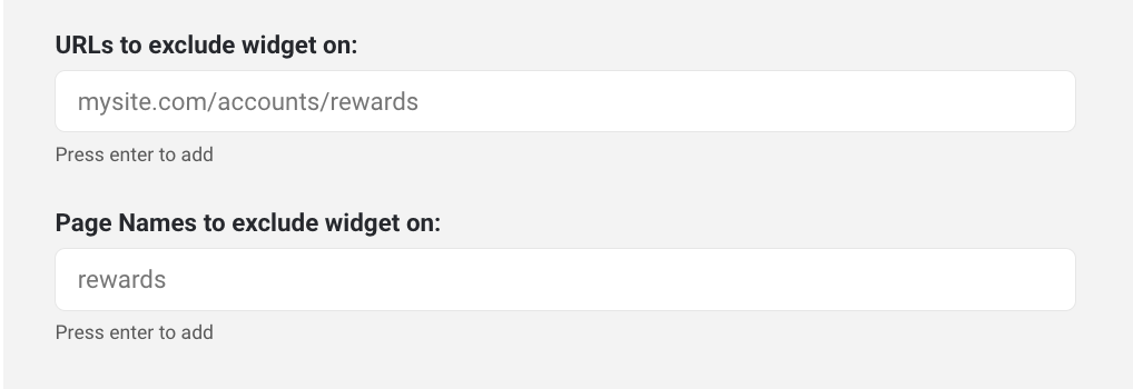
- Optionally you can also define URLs and page names to exclude the widget from:
Step 3: Choose a layout
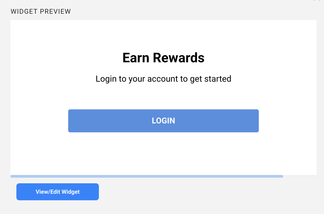
- Click View/Edit Widget.
- On the Dashboard screen, select the Loyalty Progress Bar element.
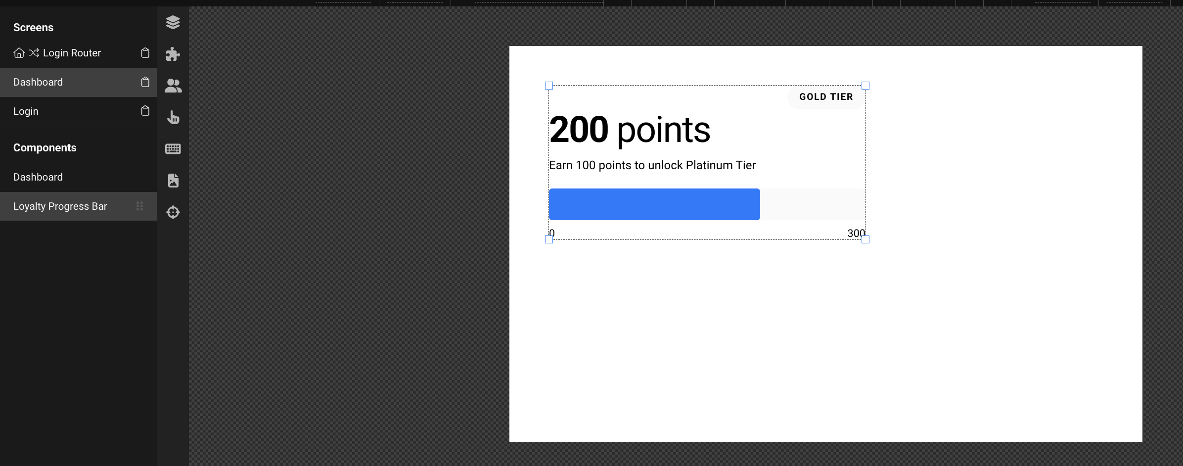
- In the Design panel, choose a variant:
Variant | What it shows | Best for |
Card | Tier badge, points headline, progress text, bar, and end labels | Account or loyalty dashboard pages |
Inline | Current and next tier, progress text, bar, and end labels (no headline) | Tighter spaces within existing content |
Compact | Bar and end labels only | Minimal placements, such as near the cart |
Step 4: Customize content and tier badges
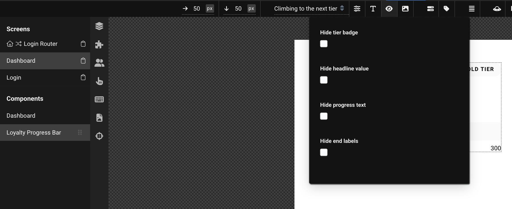
- In the Content panel, use the Hide toggles to remove elements you do not wish to display. The available toggles depend on your variant:
- Card: all four toggles
- Inline: Hide progress text, Hide end labels
- Compact: Hide end labels
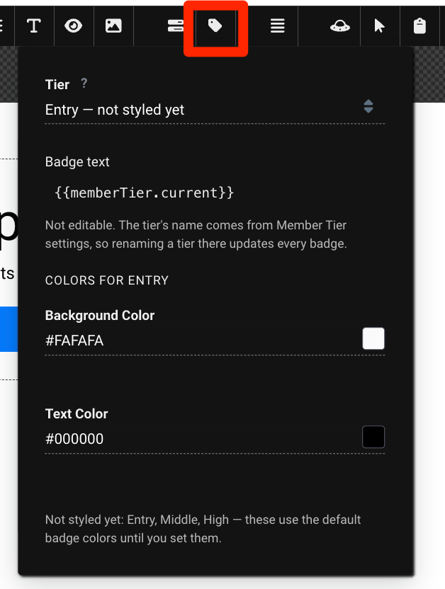
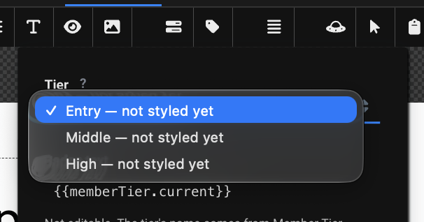
- In the Tier Badge panel, select a tier and set its Background and Text colors. The preview badge switches to that tier so you can see your changes.
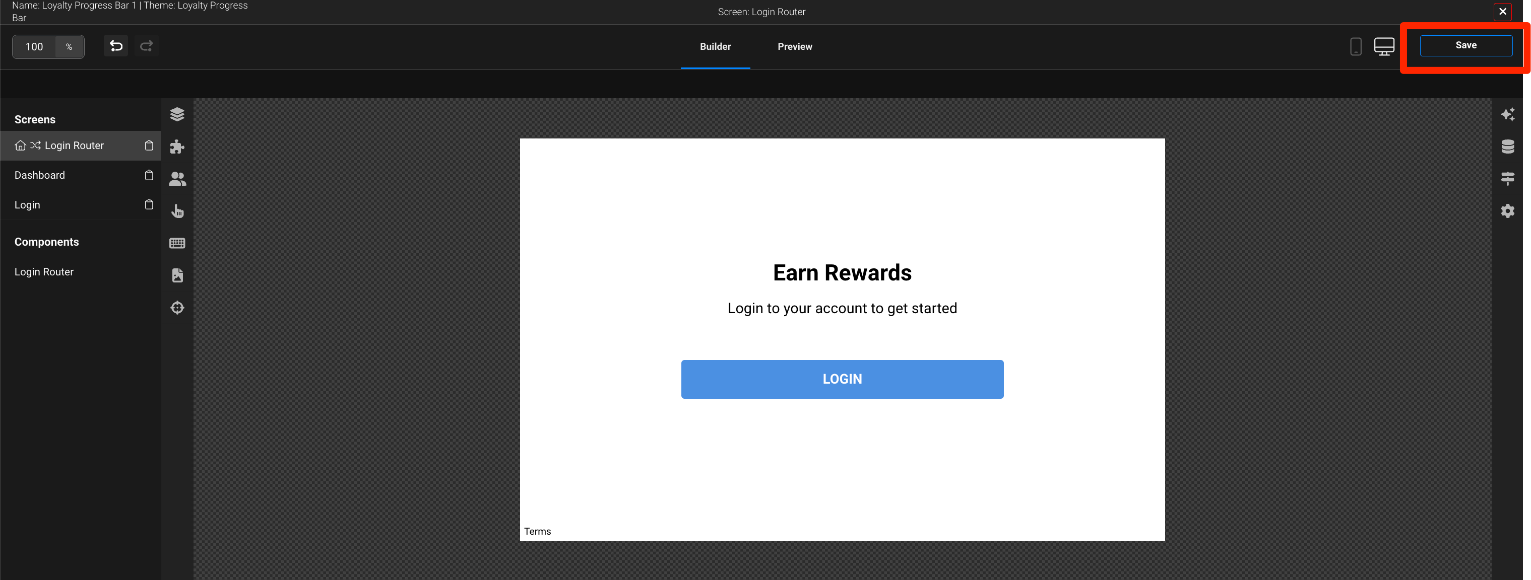
- Repeat for each tier, then click Save in the top right corner.
Step 5: Publish
- Toggle Visible on site on.
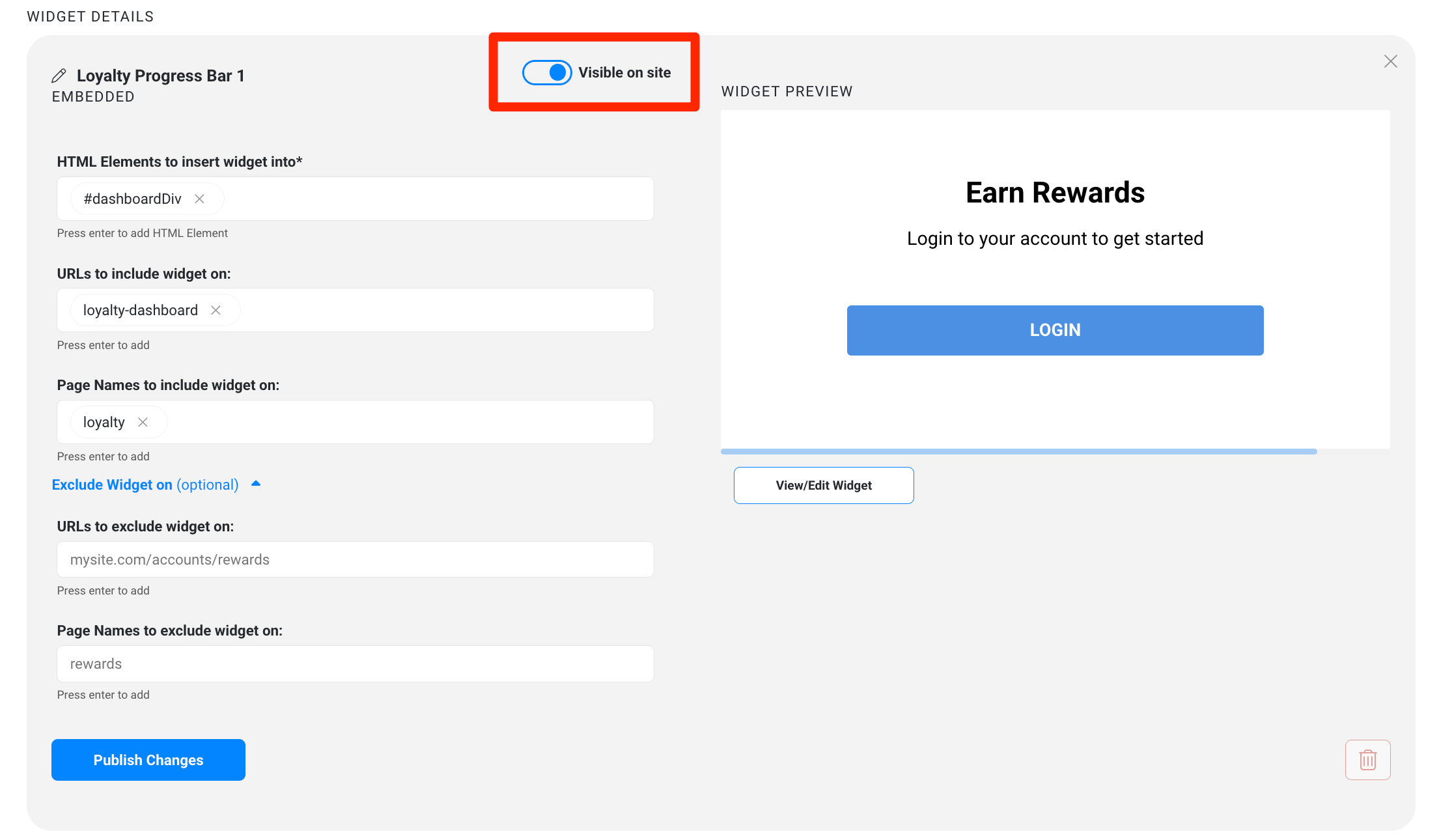
- Click Publish Changes and wait for the Loyalty Program Saved confirmation.
- Open the page on your site while logged in as your test member to confirm the widget displays.
What Your Members Will See
The widget adapts to each member's status. It's designed to show nothing rather than an error, so your site never displays a broken or empty box.
Situation | What displays |
Logged-in member working toward the next tier | Tier badge, points, progress text, bar, and end labels (based on your variant) |
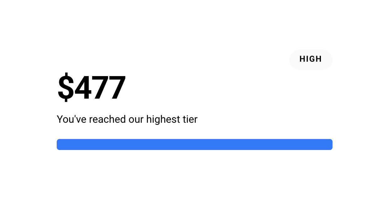
Member in your top tier | A full bar with the top-tier message; no progress text or end labels |
Member below your lowest tier | Progress bar with no tier badge |
Member in a tier you haven't styled | Badge uses the default shared colors |
Signed-out visitor | The loyalty login screen |
Member Tier program disabled, archived, or not set up | Nothing — the widget doesn't render |
Member data can't be retrieved | Nothing — the widget doesn't render |
Compact variant with no bar to show | Nothing — the widget removes itself |
FAQs and Troubleshooting
The widget isn't showing on my site. Confirm that Visible on site is on, you clicked Publish Changes, the HTML element and URL match your page, and you're logged in as a member who holds a tier. Also check that your Member Tier program is active.
The widget overhangs its container on desktop. On desktop, the widget can extend past narrow columns (below about 450px). Widen the container on your page. Mobile sizing is handled automatically.
The widget sits near the top of its section with space below it. This is expected. The bar is positioned toward the top of its area rather than vertically centered.
Why don't I see all the Hide toggles? Toggles only appear for elements that exist in your chosen variant. Card has all four; Inline and Compact have fewer.
Can I change the text on the tier badge? No. The badge always shows the member's current tier name. You can change its colors in the Tier Badge panel.
Why does my Preview State list look different from another brand's? The list only includes states your tier program can produce, so it varies based on how your tiers are configured.
One tier's badge is using the default colors. That tier hasn't been styled yet. Select it in the Tier Badge panel, set its colors, then Save and Publish Changes.